 |
http://2.bp.blogspot.com/-IdLjajFmGpY/
U4usHozBQ6I/AAAAAAAAKZo/
6_cbv5Wa_xs/s1600/ishiguro-never-let-me-go.jpg
|
 |
http://smithsonianapa.org/bookdragon/
wp-content/uploads/sites/10/2005/
05/Never-Let-Me-Know.jpg |
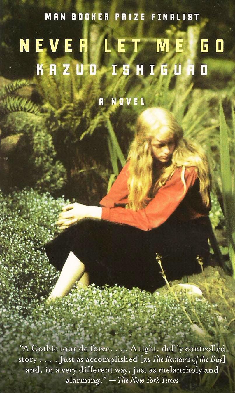
The two book covers shown above are both for Kazuo Ishiguro's book, Never Let Me Go. The first image on the left is mostly green, and includes a girl that is looking down and to her left. The girl is clearly visible and distinguishable. She is young with long blonde hair, and she stands out by wearing a red shirt against the green shrubbery. The second image to the right is mostly yellow, and includes what seems to be a girl. This girl is blurry, as is the background; it comes across as more of abstract. It is unclear to whether or not she is young, but she seems to be in motion. She has short brown hair, and she stands out by wearing a teal/blue dress against the yellow. By finding the similarity of the girl in both book covers, it could be understood that the book will revolve around the life of a girl. Also, the intended purpose of portraying the girls face as hidden in the book covers shows that there is somewhat of a mystery within the book, or possibly a struggle with finding ones' true self. But the possible reasons for various book covers include: trying to attract different audiences, appealing to the readers, portraying the book differently, having different ways to capture the books' purpose, and/or even intending for a different judgement of the book since people often judge a book by its' cover.
Book Cover #1
For the first book cover on the left, the first words that come into my mind when I see the image are 'misunderstood', 'lonely', and 'lively'. The girl portrayed is hiding her face, but wearing such a bold color, and she doesn't appear to be scared, thus causing for my thought of the word 'misunderstood.' Since she is by her self and somewhat hiding, she seems lonely. And the large plant life that is surrounding her makes me think that she may have a lively personality.
If I hadn't read the novel, this image would make me think that this book is revolving around the life of one girl, and her interactions with the live world around her. But now that I have read (some of) the novel, this cover relates to the text because the girl portrayed is most likely Kathy H, and Kathy H is the first person narrator. The book follows Kathy's story through life, along with her two best friends, and touches on points when she does feel lonely due to her two friends closer relationship.
By looking at the cover, the kind of people who would read this would most likely be girls because they could find ways to relate to the girl on the front cover. People in relationships would also be likely to read this book because when in a relationship you never want let go of, and the title is Never Let Me Go.
Book Cover #2
For the second book cover on the right, the first words that come into my mind when I see this image are 'abstract', 'interesting', and 'bold'. I think of the word 'abstract' because the way the cover seems to be painted reminds me of an abstract painting, where the object being drawn is visible yet not 100% clear. I think of the word 'interesting' because of the different shades of colors, and it says at the bottom of the cover that it is a top 10 best seller. Lastly, I think of the word 'bold' because of the organization of the words on the cover. The author's last name is the largest word on the front, and stands out compared to the title. It makes me think that he was bold, confident, and pleased with his writing.
If I hadn't read the novel, this image would also make me think that this book is revolving around the life of one girl. But now that I have read (some of) the novel, this cover relates to the text because the girl portrayed is most likely Kathy H. The cover depicts the girl as blurry, and unrecognizable, which correlates to Kathy H because she is a clone, and wants to find who she really is.
By looking at the cover, I feel that the kind of people who would read this would most likely be girls because I think the colors used would stand out and grab their attention. It also has somewhat of an antique-y book look, so the audience may be specifically older women.

